Essential Agile Processes Part 7: Release Burnup Chart
/*Essential Agile Processes Part 7: Release Burnup Chart
What is a Burnup chart?
A burnup chart shows the work completed so far as a measure against the total work. Whereas the burndown shows work remaining, the burnup shows work completed. This feature makes the burnup chart potentially more useful in several ways. First, it allows burnup charts to be stacked to show overall progress across multiple sprints. This is a powerful way to expose how much work is getting shifted from sprint to sprint without getting done (Clarios Technology, 2015).
Burnup charts also have an added line called the scope line, which shows the total project scope. The scope line is useful because any additions to the scope are reflected on the burnup chart, meaning that it’s easier to see the consequences of too many changes to the project. The downside to adding this line is that it makes the chart harder to interpret.
Many programs that can generate burndown charts can also generate burnup charts. Atlassian has a free add-on available for JIRA that can be used, and VersionOne also includes a burnup chart. Spreadsheets can also be used.
Best Practices
-
- Check the chart regularly.
Like the sprint burndown chart, the release burnup chart is effective at quickly detecting incoming problems, provided it is updated regularly. If you are using an automated solution, this is a simple task. Even if you are using a spreadsheet, make sure that updates are made regularly and communicated to the team so everyone can see the progress. Making regular updates allows maximum visibility for the team to see any problems and adjust to them.
-
- Show forecast highs and lows.
Lines representing forecast highs and lows can be used to communicate both the ceiling and floor for the team, or the best possible and worst possible effort based on previous data. If little to no previous data exists, start with what is available and include the forecasts when there is enough data, or use a margin of error percentage.
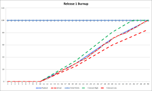
On the chart below, you can see a forecast high and low assuming 15 percent greater or less performance than the planned. Forecast high is in green dashes and forecast low is in red dashes. The actual release performed very closely to plan, but you can see the forecast high resulting in an early finish, while under the forecast low, the team would not have finished the release.

Pitfalls
-
- Setting too many commitments based on the burnup chart results.
Many different factors can cause a team’s actual output to differ from what is shown in projections. It’s important to let stakeholders know that the chart represents ideal output and to expect differences, especially if the team encounters barriers.
-
- Not communicating the chart effectively.
Because the burnup chart is more complex than the burndown chart, it needs some more explanation. If stakeholders don’t understand what the chart means, they won’t be able to use it to make decisions. Therefore, it’s important that everyone on the team knows how to read the chart and detect trouble spots based on the results.
If you are looking for further assistance, or have a specific roadblock you need to get around, we’re happy to help. Download our Release Burnup Chart Template from our Knowledge Base and talk to us about any Agile challenges you are facing.