Essential Agile Processes Part 6: Sprint Burndown Chart
/*Essential Agile Processes Part 6: Sprint Burndown Chart
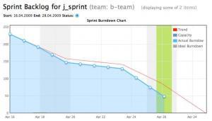
Setting up the sprint burndown chart is simple once you have activities broken into tasks. You can do it with nothing more than a spreadsheet. Plot the sprint’s total work, total length, ideal burndown, and actual burndown or work remaining. The more frequently you can obtain updates on work performed, the better. If you have access to an online tool, like TFS, JIRA, or VersionOne, you also have access to a sprint burndown chart that will likely be populated based on work completed.
Best Practices
-
Paying attention to what the chart is saying.
With so few lines on the chart, people may be deceived into thinking this is a simple chart. This misconception may lead them to ignore, or misinterpret, signs of problems with the sprint or even the team’s implementation of agile. An ideal team should stay as close to the ideal curve as possible, with small peaks or valleys naturally occurring as part of common variance. Such a curve means that the team completed the work required by the sprint on time, their capacity estimates were sound, and they did not over-commit. Dusan Kocurek (2011), writing in Methods and Tools, identifies some features of a chart that might indicate problems:
- Actual curve finishing above ideal curve: The team did not finish all of the work in the sprint.
- Actual curve finishing below ideal curve: The team finished all of the work in the sprint too early and was idle afterwards. In these cases, it is ideal for the team to pick up more work if they can.
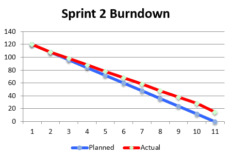
- Actual work curve rising: Work was added or discovered in the middle of the sprint. See the example below.
- Large peaks or valleys: The team was not consistent in their work. Notice below that the team also had the problem of work being added to the sprint, as mentioned above.

These are a few examples of team problems exposed by the chart that might not be recognized at first. It is up to the team not only to improve their results, but also improve in interpreting the results.
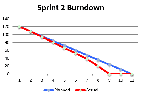
In contrast to the above, below is a chart indicating a healthy sprint:

Notice that there is little deviation between planned and actual. To expect no deviation is unrealistic, so evaluators should instead pay attention to how much deviation there is. In this case, the greatest deviation occurs around the fifth through seventh reporting periods. Another characteristic of a successful sprint is that the team finished all the work. There was no work left, and the team did not take on any additional work. While taking on additional work is not a bad thing, finishing the exact work in the exact time shows the team has developed their skills of estimating both tasks and capacity.
-
Adding impediment indicators.
Kocurek (2011) also recommends adding “impediment indicators” to the burndown chart. These are markers for key events that proved to be roadblocks or impediments for the team. Marking them on the chart can help explain later that the team’s performance was slowed due to the factors indicated. For example, one impediment indicator might be sick days for a person playing a key project role. If work could not proceed because of this person being out, that should be indicated somewhere so people know. These indicators can also be useful for retrospectives later, so that impediments are identified upfront rather than team members having to try and recall why delays happened.
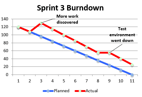
Below is another example of a sprint that did not go well. In this fictional third sprint, two issues come up and cause the team to fall short of the sprint goal. Notice that one caused remaining work to go up and one caused no work to be done. Impediment indicators could also be used to show that less work was completed than anticipated. These would mainly be used if there was significantly less work completed than usual or there was a special cause for the variation, rather than a common cause (for example, several team members are out)
Pitfalls
-
Putting in tasks that are too large.
If your tasks are still too large at the sprint level, the burndown chart is where this problem will begin to show. Mittal (2013, 7 August) suggests that tracking becomes more difficult if a task is over 12 hours. If there are many large tasks, it will be difficult for the team to estimate their progress on a daily basis, and the chart will be distorted as a result. If there are opportunities to break tasks into smaller chunks, be sure to explore the possibility.
-
Not taking corrective action based on the chart.
Taking corrective action based on the chart readout is a fine line. Acting too early causes unnecessary panic and may introduce problems on top of what the team is already working through. Acting too late, however, can prevent the team from being able to complete the sprint goal. When to act, and what corrective action to take, is something that can best be refined through sprints, maybe 6-10 sprints. If any problem has been a trend for two or more sprints, or if any problems are major, then corrective action is necessary; otherwise, it may be okay to hold off.
Conclusion
If the sprint backlog and capacity planning sheets are where the “rubber meets the road” on agile projects, then the burndown chart is the travel log of where the team has gone. Knowing how to set it up, and how to interpret what it displays, are both key to keeping the team able to deliver sprints. For this reason, we highly recommend using the burndown chart for agile projects.
If you are looking for further assistance, or have a specific roadblock you need to get around, we’re happy to help. Download our Sprint Burndown Chart template and get in touch with us about any Agile challenges you are facing.
References
- Kocurek, Dusan (2011). Understanding the Scrum burndown chart. Methods and Tools. Web.
- Mittal, Nitin (2013, 7 August). The burn-down chart: An effective planning and tracking tool. Scrum Alliance. Web.